Aesop Fitzroy
Emerging from its restorative hiatus with a hand-finished new face, Aesop Fitzroy’s finely detailed design is an ode to the history of its location in Melbourne’s first suburb. Among its neighbours, including creative studios, galleries and a bustling urban junction, Aesop’s new fit out provides a welcome sense of quiet.
Having completed the store’s previous design 10 years ago, Aesop Fitzroy’s new fitout became CCA’s second opportunity to meet the requirements of the local brand within the space. While the original fit out explored the ready-made, a resourceful design composition of proprietary plywood boxes, the new space explores nostalgic domestic ritual.
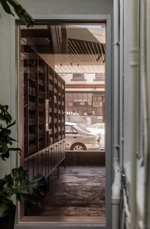
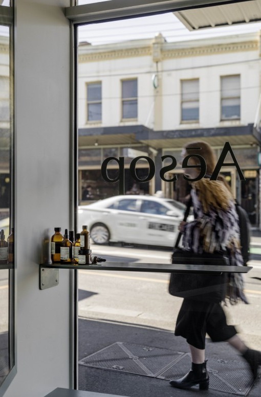
With much changing on Gertrude Street over the past decade, this new iteration is mindful of the project’s potential to contribute to the existing street culture and help foster a sense of local community. The original, unremarkable shop front is retained, a deliberately understated street presence, enforcing the notion of its longstanding presence in the area. The existing shell is altered sparingly, retaining original steel windows, steel beams and the charmingly rustic concrete slab.
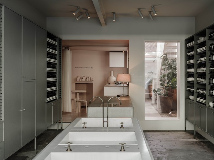
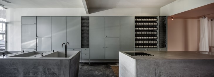
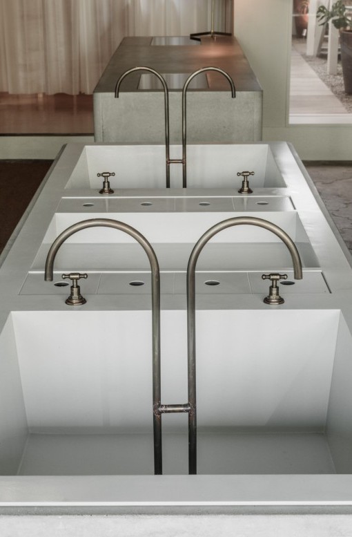
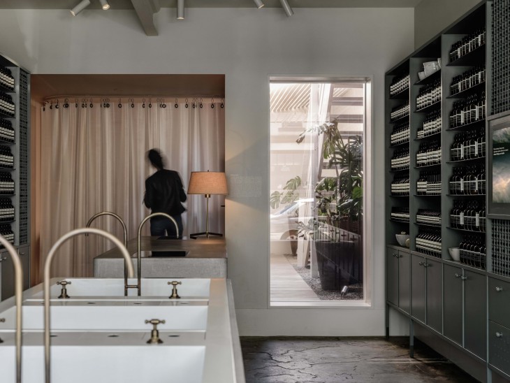
Visitors are immersed in muted hues, subdued lighting and a refined material palette, within an environment carefully crafted to reflect the brand’s contemplative persona. Inspired by laundry washing troughs commonly found in lean-to structures behind early housing, the space features an insitu-cast concrete vessel fitted with delicate, aged brass tapware in reference to Fitzroy’s early blacksmith industry.
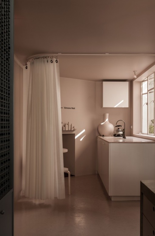
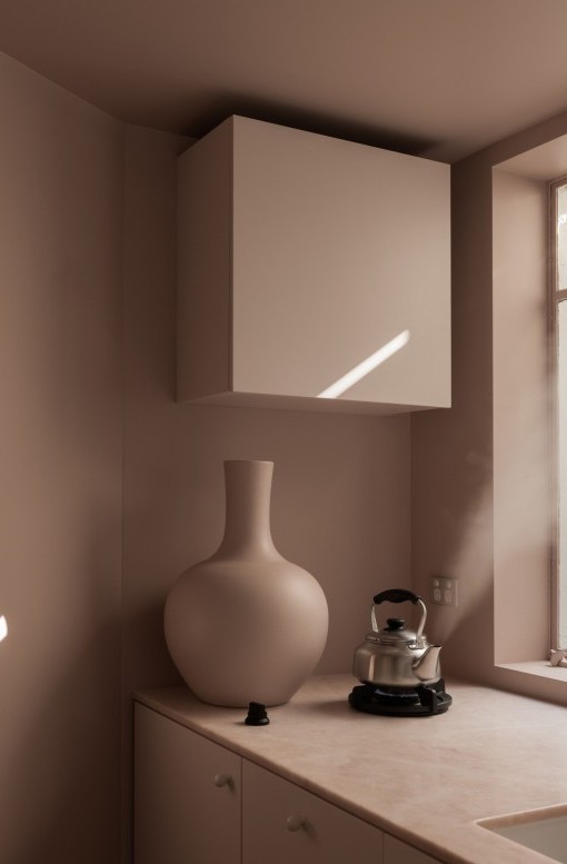
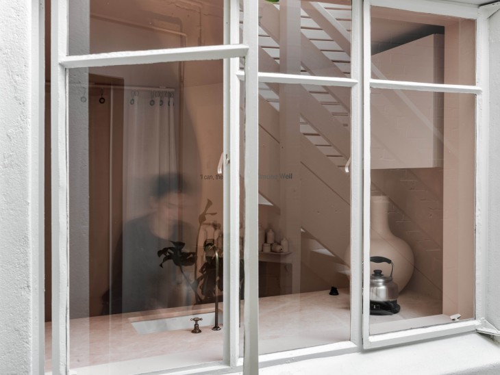
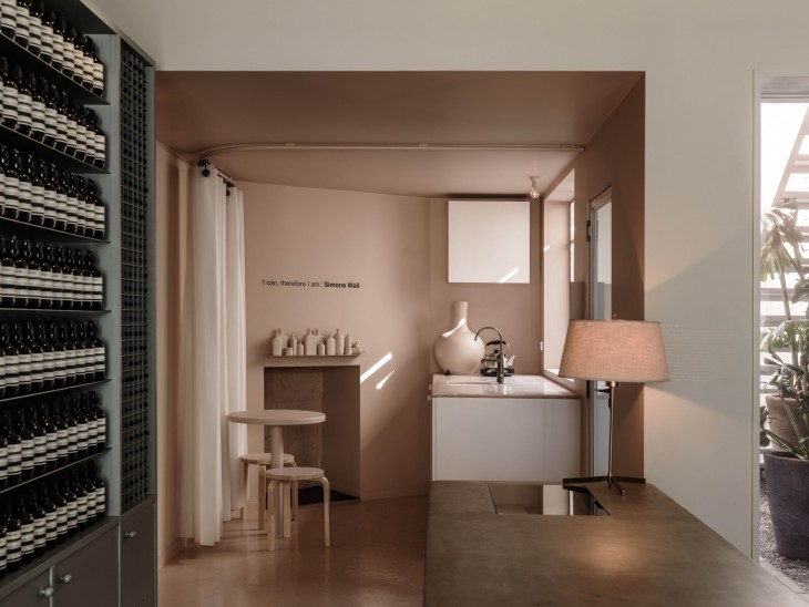
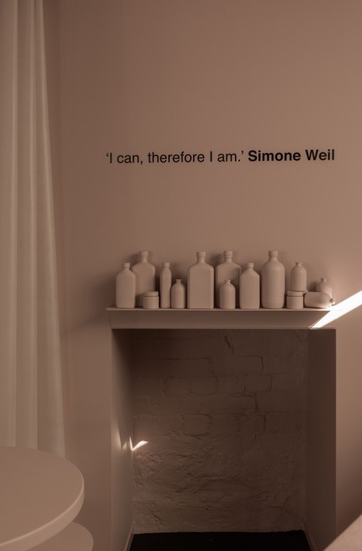
Beyond the point of sale counter in a former store room, ideas of domestic rituals are abstracted through the exclusive use of blush pink, complete with Italian ‘Rosa Salmonato’ marble bench top, a hearth, and functional kitchenette with integrated burner and sink. Ribbons of silicon form a curtain that can be drawn to mediate levels of privacy between zones, providing a casual breakout space for staff as well as a stylised vignette from the street.
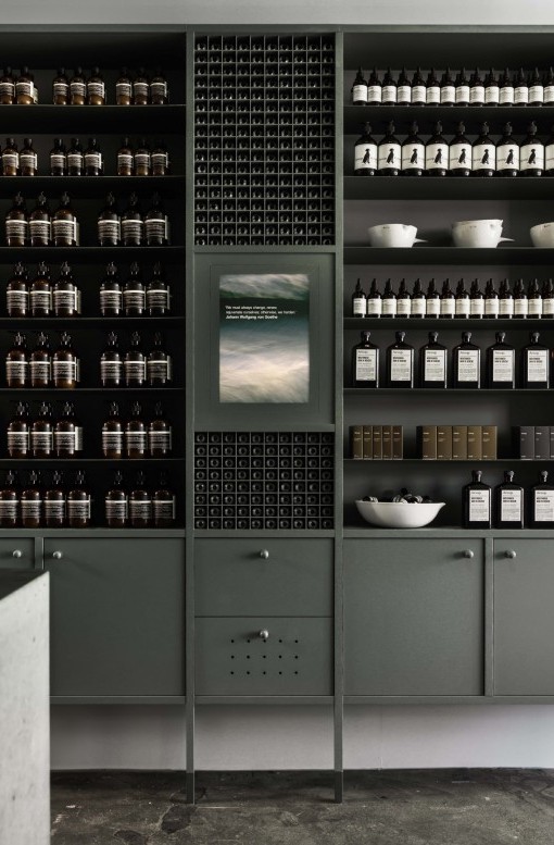
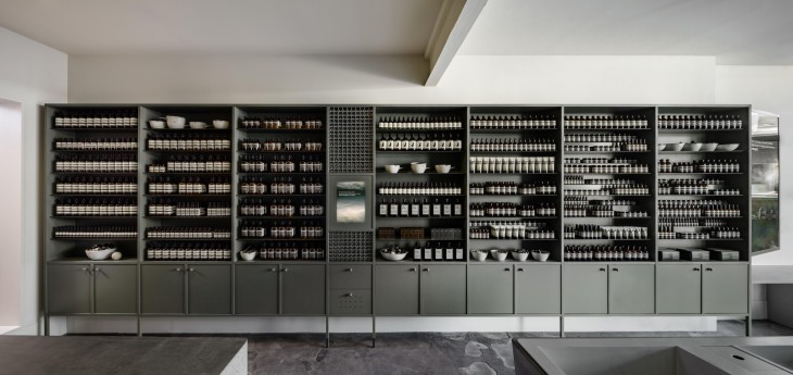
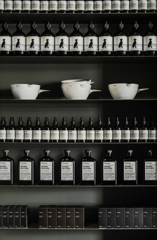
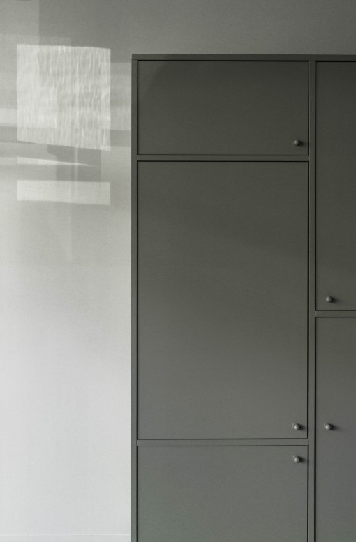
Cabinetry elevated on slender legs display Aesop’s signature amber bottles in a rhythmic fashion. Hand-painted in soft green both internally and externally to subtly emphasise the importance of the maker, the cabinetry maintains the quality of the finish even behind closed doors. Familiar cupboard handles are a nostalgic nod to unrenovated terrace house cabinetry.
Typical storeroom items are discretely accommodated within the retail area cabinets, a composition of various door sizes to suit the contents. Discrete perforations within doors allow Aesop’s signature scent to permeate the space for a sensory and emotive experience.
Located on Wurundjeri country.
Design Team
Clare Cousins, Sarah Birthisel
Photographer
Trevor Mein
